Mobile Customer Journey: 10 Metrics That Reveal Where Mobile Users Actually Convert

Burkhard Berger

April 14, 2026
Most teams track mobile like a smaller desktop screen. That habit hides the real signals. The mobile customer journey is different. Here, small delays matter. Layout choices matter. Loading order matters. A tap means commitment. A swipe means hesitation. One smooth interaction can carry the whole mobile experience. One rough edge can end it.
This article pulls the focus away from shallow performance and into movement. We will share 10 metrics that will show exactly where conversions happen – and where they don’t. On top of that, you will get 8 strategies to map out the customer journey for mobile users.

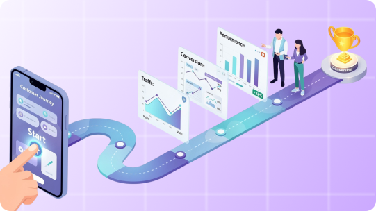
Mobile customer journey is the complete path a user follows on their phone, from the first mobile touchpoint to the final action you care about, and everything that happens in between.
It starts when someone sees a mobile ad or opens a link inside an app or social feed. It continues through every scroll, tap, swipe, pause, and exit across mobile websites, apps, system-level prompts, and in-app messaging. It ends when the user converts, drops off, or returns later to continue the journey.
What makes the mobile customer journey different is context. Mobile users navigate and act fast. They switch apps quickly. They get distracted. They expect everything to load instantly and work perfectly with one hand. If anything slows them down, they leave.
The journey usually includes:

Mobile journeys fail at very specific moments that most product teams never bother to measure. Here are 10 metrics that focus on those moments so you can see exactly where the mobile app customer journey either keeps moving or stops cold.
Tracks what happens after the very first intentional action.
This metric focuses on a single moment – the first deliberate tap. That tap might be on a CTA, a product card, a push notification, or a promotional banner. Tap-To-Conversion Rate measures how often that first action eventually leads to a conversion within the same session or within a defined attribution window.
This tells you whether your entry points are aligned with real intent. High traffic with a low tap-to-conversion rate means your CTAs attract curiosity but fail to match what users expect after tapping. Strong performance here shows clarity and relevance of the personalized messaging right from the time users interact with it.
What to Track Specifically:
Shows whether installs come from buyers or browsers.
This metric starts with app download and installation. It measures how many of those installs turn into purchases within a defined timeframe.
It exposes the install quality. A high install volume with a weak install-to-purchase rate points to poor targeting or weak onboarding. Strong performance here means the mobile app user journey experience immediately reinforces why the new customer installed it in the first place.
What to Track Specifically:
Measures whether checkout works under real mobile pressure.
This metric tracks how many users who enter the checkout flow actually complete it on mobile. It focuses only on checkout, not browsing or cart behavior.
Mobile checkout fails for very specific reasons – slow load times, confusing address fields, forced account creation, payment friction. This metric isolates all of that into a single performance signal.
What to Track Specifically:
Reveals whether intent survives hesitation.
This metric tracks users who already showed buying intent by adding an item to their cart and measures how many of them actually complete a purchase.
It shows hesitation moments. Pricing shocks, delivery fees, stock anxiety, or decision fatigue usually surface here. A strong rate means your customer experience helps with the decision instead of interrupting it.
What to Track Specifically:
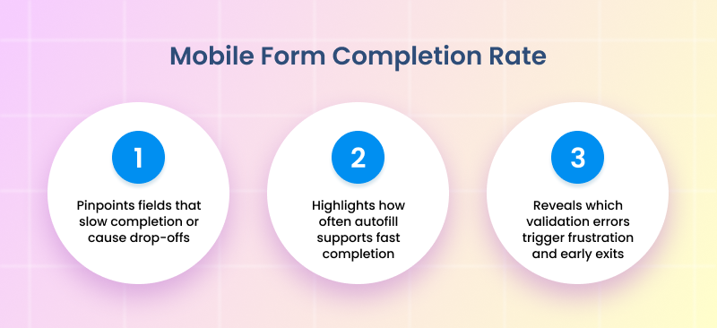
Measures how many users start a form on mobile and finish it.
This metric applies to any form on mobile. Mobile forms fail when fields are excessive or validation errors appear late. This metric exposes where form design works with mobile behavior instead of fighting it.
What to Track Specifically:
Tracks the exact time between session start and conversion on mobile.
Short times usually indicate impulse or high user satisfaction. Longer times point to research behavior, comparison, or friction. Both patterns carry value when understood properly.
What to Track Specifically:
Identifies the exact screen that breaks momentum.
This metric tracks where users leave the funnel, screen by screen, instead of step by step. Each screen becomes its own performance checkpoint.
This level of tracking exposes invisible pain points like overloaded layouts or confusing transitions. One weak screen can quietly destroy conversions.
What to Track Specifically:
Measures successful transactions by payment method on mobile.
Some payment methods look popular yet fail at the confirmation stage. Others convert quietly with fewer errors. This metric tells you which options deserve priority placement and optimization.
What to Track Specifically:
Tracks conversions that start on mobile and finish elsewhere.
It captures mobile’s role as a decision driver rather than a final stop. Strong performance here shows mobile content builds early customer loyalty even when the purchase happens later.
What to Track Specifically:
Directly compares conversion performance between in-app users and mobile web users.
Apps offer speed and deeper personalization. Mobile web offers accessibility and lower commitment. This metric shows where your conversions truly thrive and where investment brings stronger returns.
What to Track Specifically:
Since 81% of people research online before making a major purchase, getting mobile behavior right matters more than ever. Here are 8 strategies that walk through exactly how to map what active users actually do on their mobile phones, not what the diagram says they should do.
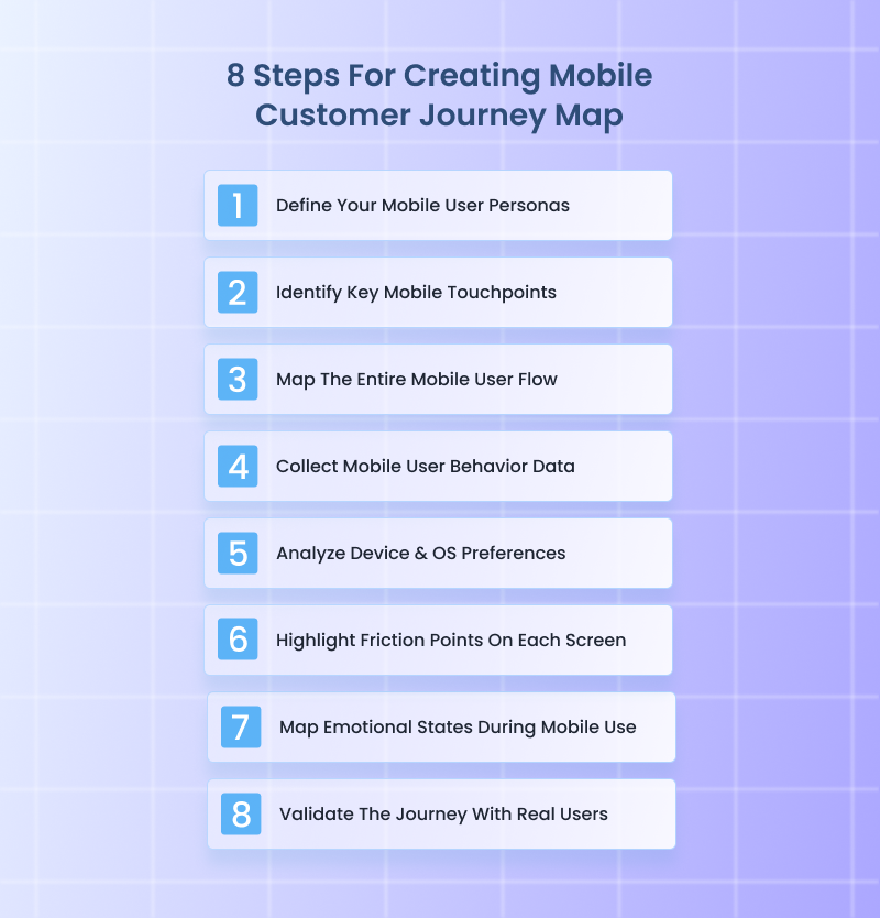
Mobile personas are not desktop personas shrunk down. You have to separate users based on how and why they use mobile in the first place. One user opens your app while standing in line. Another scrolls your site late at night. Those two people make decisions differently.
Build buyer personas using mobile-specific traits only, not demographic data. Focus on context first. Where they are. What triggers the session. How much time they usually have. What they already know when they land.
What to Do:
Real-World Example:
When Voices.com optimized their mobile experience, the team didn’t just assume all visitors behaved the same – they actually segmented mobile users into distinct intent groups based on behavior data and goals.
They tracked users who arrived on mobile looking for quick price estimates, those browsing talent portfolios between meetings, and those returning later to request auditions.
By doing this, they realized mobile sessions under 2 minutes usually belonged to quick scope-out researchers, while longer sessions with deeper scrolls usually belonged to decision drivers who would eventually request quotes.
With these personas, Voices.com adjusted how its site presented information. Quick researchers got immediate rate ranges and category filters right up front, while decision drivers saw portfolio highlights and direct contact options buried deeper until they showed engagement.
This kept visitors moving – all because the team built personas from actual mobile context and behavior, not generic desktop assumptions.
Mobile app journeys restart constantly. A user leaves, gets distracted, then returns hours later through a completely different entry point. Touchpoints are not channels. They are re-entry moments that reset user context and expectations. This step helps track customer journeys to see where they actually begin or change direction on mobile.
What to Do:
Real-World Example:
A great real-world example of this done right is this Wyoming virtual office services company. Their mobile experience clearly understands that users rarely arrive the same way twice. Someone might first land on their site from a Google search while comparing LLC services, then finally return through an email reminder when they are ready to file.
What makes Start in Wyoming stand out is how their mobile touchpoints reset context cleanly. Re-entry users are guided straight back to the task they were already considering, instead of being forced through generic homepage messaging again.
Informational entries lead to simple explanations and trust-building content. Transaction-ready entries lead directly to formation steps. Reminder-driven entries pick up exactly where momentum was lost.
This approach keeps mobile sessions focused and productive. Every mobile touchpoint clearly matches intent, which is why users move forward instead of bouncing. That level of clarity is exactly what this step is designed to produce when executed well.
This is where you stop thinking in funnels and start thinking in screens. Map the journey screen by screen, tap by tap. Include loading states, permission prompts, and error messages.
Mobile users feel friction instantly. A single awkward transition can end the session. Your map should show reality, not how you wish the flow worked.
What to Do:
Real-World Example:
CodaPet is a strong example of what it looks like when the entire mobile user flow is mapped deliberately from the first interaction onward. You can tell the journey was mapped tap by tap, not just screen by screen.
CodaPet perfectly handles transitions that usually break mobile flows. When users move from reading to entering information, or from entering details to confirming next steps, the shift feels planned. There are no abrupt jumps, no moments where the interface suddenly asks for something unexpected.
Context switches are also accounted for. When the journey moves into form entry or confirmation steps, the transition is gradual and signposted, which keeps momentum intact. Time-heavy steps are spaced intentionally, while lighter steps move fast.
The result is a mobile flow that is continuous from start to finish because it was mapped as one connected path, exactly as this strategy requires.
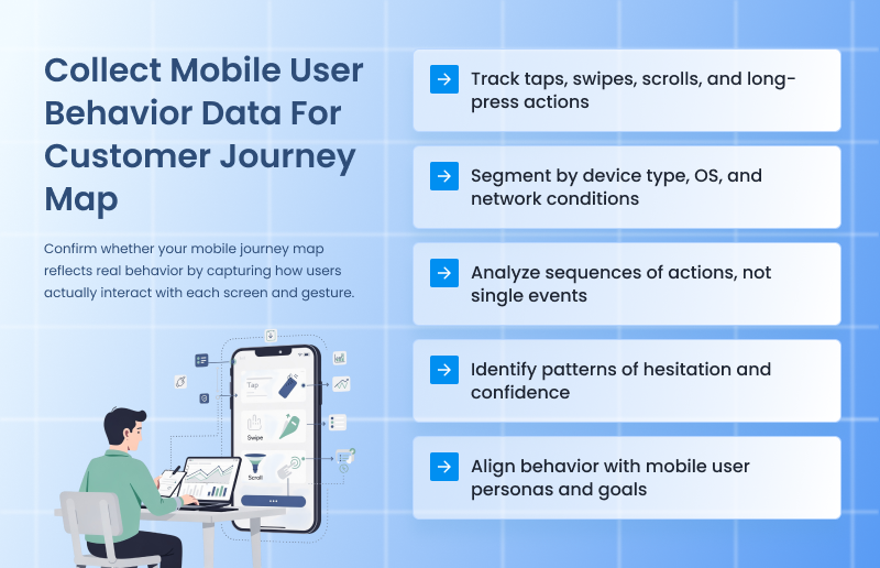
Now you validate the map with the gathered data. Pull behavior directly from mobile analytics, session recordings, heatmaps, and event tracking. Focus on what loyal customers do, not what they say. Look for patterns. Repeated exits. Rage taps. Long pauses. These behaviors reveal friction that the flow alone can’t explain.
What to Do:
Real-World Example:
When Gogoprint noticed high exit rates on critical pages in their mobile experience, traditional analytics like bounce rate and page time didn’t explain why people were leaving. So the team paired click heatmaps with session recordings to see exactly how users interacted with key elements on their mobile site.
That combination revealed specific behavior patterns, such as where people tapped frequently but nothing happened, and sections users struggled to scroll past – insights that raw traffic numbers never exposed.
With that data, they pinpointed exact friction points on mobile – like buttons that felt tappable but weren’t, and content areas where users paused then abandoned – and fixed them one by one. After applying these behavior signals directly into their optimization roadmap, Gogoprint reduced drop-offs in their conversion funnel and made mobile browsing intuitively responsive.
Phones are not neutral containers. A user on a small Android device with spotty memory behaves very differently from someone on a large iPhone with Face ID and saved payment methods. Device and OS choices quietly control speed and patience. This strategy exposes those constraints so your user journey map shows real hardware limits, not abstract user intent.
What to Do:
Real-World Example:
This sewing machine eCommerce store’s mobile experience clearly shows decisions made after looking closely at device and OS behavior, not just overall conversion data.
On older Android devices, product pages load in lighter chunks instead of all at once. Images appear progressively, and secondary details stay collapsed until the user scrolls, which reduces memory strain and keeps the page responsive.
On newer iPhones, the same pages surface richer visuals earlier and rely more heavily on native autofill and saved payment behaviors to move users through faster.
Checkout also adapts quietly. Keyboard interactions behave differently across devices, and the store accounts for that by spacing fields to avoid overlap and keeping critical actions visible even when the keyboard is open. Payment options surface in different orders depending on OS, which reduces hesitation instead of forcing users to hunt.
None of this is obvious at a glance, and that is the point.
Every screen carries friction. The job here is to expose it clearly and specifically. When you mark friction at the screen level, the journey map becomes a repair plan instead of a diagram.
Here, you focus on isolating what slows users down on each screen, not why they arrived there. And each friction point should describe a single problem. Documenting friction this way ensures the journey map helps build a growth-ready business operations system, not a one-off UX audit that gets ignored after launch.
What to Do:
Real-World Example:
The mobile journey of Custom Sock Lab clearly treats every screen as something to be stress-tested, not admired.
On their mobile product customization screens, friction is isolated instead of hidden. Dropdowns that matter stay short and visible. Optional choices stay collapsed until a user asks for them. When users pause, it is usually at one exact element, like size selection or quantity input, not the entire screen.
Form screens show the same thinking. Fields are spaced to prevent mis-taps, and validation feedback appears immediately instead of after submission. Users who correct an entry are taken forward, not pushed backward. That eliminates the loop where people re-enter the same information multiple times.
Even the load behavior is intentional. Design previews load in stages instead of blocking the screen, which avoids the dead moments that usually cause exits. Each screen does one job, and friction is treated as a specific fixable issue, not a vague UX problem.
Mobile behavior is emotion-driven because attention is fragile. A user starts curious, shifts to cautious, then either gains confidence or feels annoyed. These shifts matter more than UI polish. Mapping emotional states adds context to behavior and explains why more users hesitate or abandon without obvious technical issues.
What to Do:
Real-World Example:
A clean example of this in action is how this Hilton Head real estate consultant handled emotion across his mobile experience. Real estate decisions carry tension by default, so instead of pushing urgency everywhere, the mobile journey is tuned to emotional pacing.
Early screens lean into calm and reassurance. Property listings load fast, photos are full-width and swipe smoothly, and there is no pressure copy fighting for attention. That keeps the user in a curious, exploratory state instead of triggering hesitation too early.
As users move deeper, the emotional tone shifts intentionally. Saving a listing or tapping “Schedule a Showing” introduces subtle confirmation cues. Short success messages appear instantly. Calendars don’t jump screens. The experience reinforces confidence at moments where doubt usually creeps in.
What stands out is how emotional spikes are handled. Pricing pages and availability checks are common stress points in real estate. On mobile, those screens avoid clutter and delays, reducing aggressive taps and backtracking. The result is fewer rage taps, longer session depth, and smoother progression from browsing to outreach.
No journey map survives contact with real users untouched. Validation ensures your map reflects how people actually experience the journey, not how analytics summarize it. Remember, this step is about listening and effectively communicating with the clients to understand their needs and expectations, not pitching or explaining.
What to Do:
Real-World Example:
Luciq (formerly Instabug) actively brought real users into structured validation sessions on their own product before major releases. For example, when Luciq was preparing a revamp of its mobile SDK onboarding flow, they had target customers walk through the setup on their own devices while researchers watched remote video sessions.
They timed tasks, noted where users hesitated, and logged every point where users verbally expressed confusion or frustration. Researchers even interrupted users with simulated distractions like mid-session notifications to see whether people recovered or abandoned tasks.
Then Luciq rewrote journey steps using the exact language users used to describe confusion (“I thought this button meant something else,” one tester said), and updated messaging and UI labels to reflect that. This was using real mobile behavior and words to validate and refine the map itself, which made the final experience dramatically smoother for customers.
The mobile customer journey falls apart because most teams watch the wrong moments and then act surprised when conversions disappear. Mobile consumers are decisive. They either move forward or they vanish. There is almost no middle ground.
The smartest move now is focus. Pick the metric closest to money. Fix what blocks it. Then move to the next. Do this in order, not all at once. Mobile rewards clarity and follow-through. Everything else is overthinking.
At Funnelytics, our platform offers real maps that connect traffic sources, pages, events, ads, and conversions into one visual flow, so you know exactly what is working and what is costing you money. You get valuable insights fast, thanks to automatic tracking, conversion paths, and segmentation that match the way customers move today.

Burkhard Berger is the founder of Novum™. He helps innovative B2B companies implement modern SEO strategies to scale their organic traffic to 1,000,000+ visitors per month. Curious about what your true traffic potential is?
Sign up for your free 14-day trial today and experience all the benefits Funnelytics will bring to your business first-hand. No contracts. No commitments. Just full-on customer journey insights.
.png)

